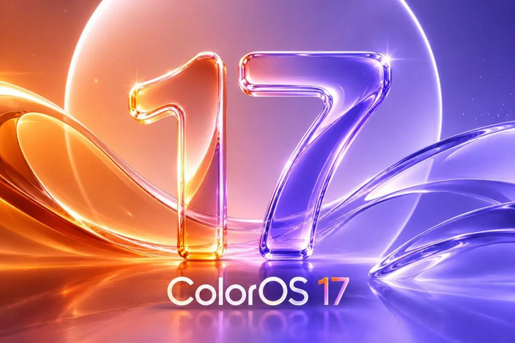
ColorOS 17 is reportedly adopting sophisticated, Apple-like visual elements, introducing liquid glass aesthetics and significantly smoother dynamic effects into its user interface.
The rumored overhaul suggests a substantial design pivot for OPPO's operating system, moving toward a highly polished, fluid user experience reminiscent of recent iOS updates. Details leaked from developer previews indicate that the focus is less on radical functional changes and more on refining the visual language to achieve premium perceived quality across supported hardware.
Central to this update is the incorporation of "liquid glass" visuals. This design trend implies a greater use of translucency, depth effects, and subtle material blending within system elements—such as notification panels, widgets, and application chrome. Such features are designed not merely for aesthetic appeal but also to create a more intuitive sense of spatial hierarchy on the screen.
Furthermore, sources indicate that ColorOS 17 will feature demonstrably smoother animations and transitions throughout the operating system. This enhancement targets perceived responsiveness; even if underlying processing speeds remain consistent, highly refined motion design can make the entire interaction feel faster and more deliberate to the end-user. The implementation of these dynamic effects is expected to address prior criticisms regarding interface choppiness in previous iterations.
Design Philosophy and Implementation Details
The strategic adoption of Apple's visual paradigms signals a competitive response within the increasingly saturated Android customization market. While ColorOS has long championed unique, highly customized skins, this direction suggests a calculated move toward universal design language benchmarks recognized for their polish. The integration will likely be selective; developers are expected to adapt these advanced visual treatments without compromising the core functionality or established usability patterns users expect from OPPO devices.
Specific rumored features point toward enhanced gestural navigation fluidity and redesigned system icons that incorporate more subtle depth gradients. This meticulous attention to micro-interactions is characteristic of high-end software releases, aiming to elevate ColorOS 17 beyond mere functional iteration into a genuinely premium experience category. The underlying framework supporting these visual demands will require optimization across various chipset tiers.
The transition represents a maturation of the ColorOS ecosystem, suggesting that OPPO is investing significant engineering resources not just into new hardware capabilities but into perfecting the software layer that users interact with daily. This focus on aesthetic refinement directly impacts brand perception in the global smartphone market where visual polish often correlates strongly with perceived device value.
Market Implications and Release Trajectory
The introduction of these refined visuals positions ColorOS 17 to compete more aggressively against high-end devices from rivals who have heavily invested in fluid, modern UI design. Successfully executing the "liquid glass" concept will be critical; poorly implemented translucency can appear muddy or distracting rather than sophisticated.
While official rollout timelines remain unconfirmed, leaks suggest that development is progressing rapidly toward final testing phases. Users should anticipate these visual enhancements appearing on newer flagship devices first, followed by staggered updates to older supported models. The ultimate success of this design direction will hinge upon how seamlessly the new visuals integrate with ColorOS's existing feature set.